An AI health-intelligence layer that connects your signals, uncovers what's driving your health, and suggests the next best step.
Helix connects fragmented signals (wearables, bloodwork, symptoms, hormone cycle, and medications) into a single causal model, then traces the most plausible chain behind a user's question, cites their own data for every link, and surfaces the single highest-impact action to take next.
Scope of Work
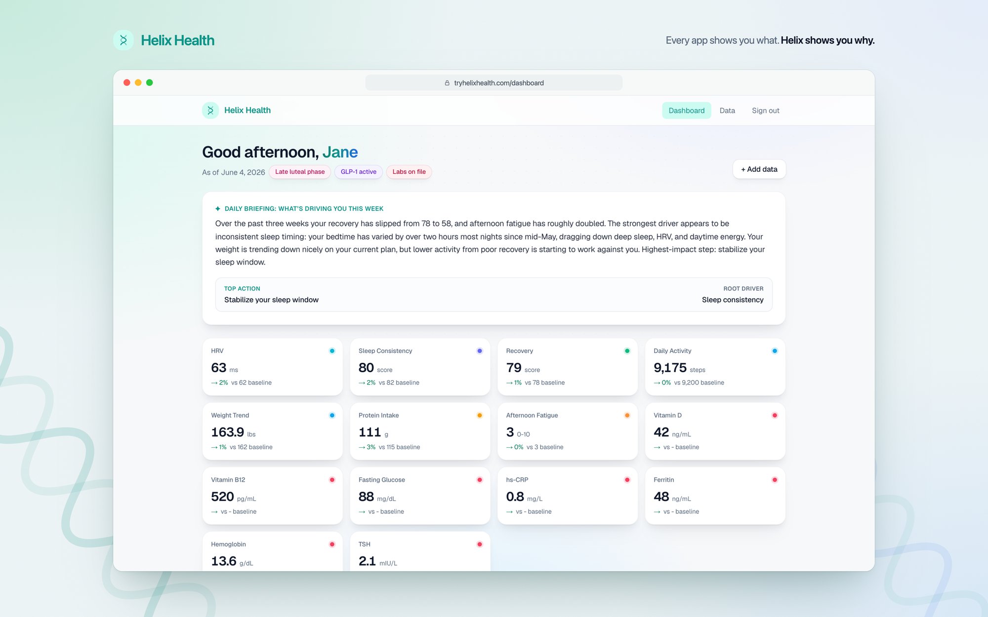
I built Helix Health, a full-stack Next.js 15 (App Router) app that turns raw health data into explained, evidence-cited insights. At its core, Claude Opus is forced through a typed tool call, with output validated by Zod and retried on failure, to produce a ranked causal-chain graph. It's grounded against hallucination by a hand-curated knowledge base of 45 physiological priors assembled into a per-request evidence packet.
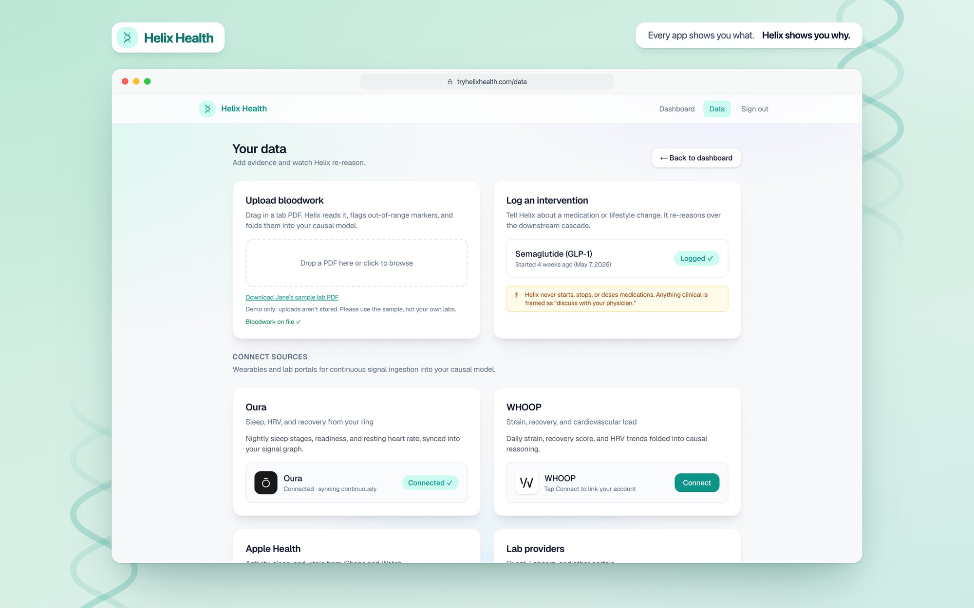
I designed the full Supabase/Postgres backend (normalized tables under row-level security with private file storage) and three API routes: Claude reasoning over the evidence packet, Claude Haiku extracting biomarkers and reference ranges straight from an uploaded lab PDF, and intervention logging that triggers re-reasoning.
On the frontend, the signature feature is a self-drawing causal-cascade visualization built in Framer Motion that renders the reasoning as an animated dependency graph.
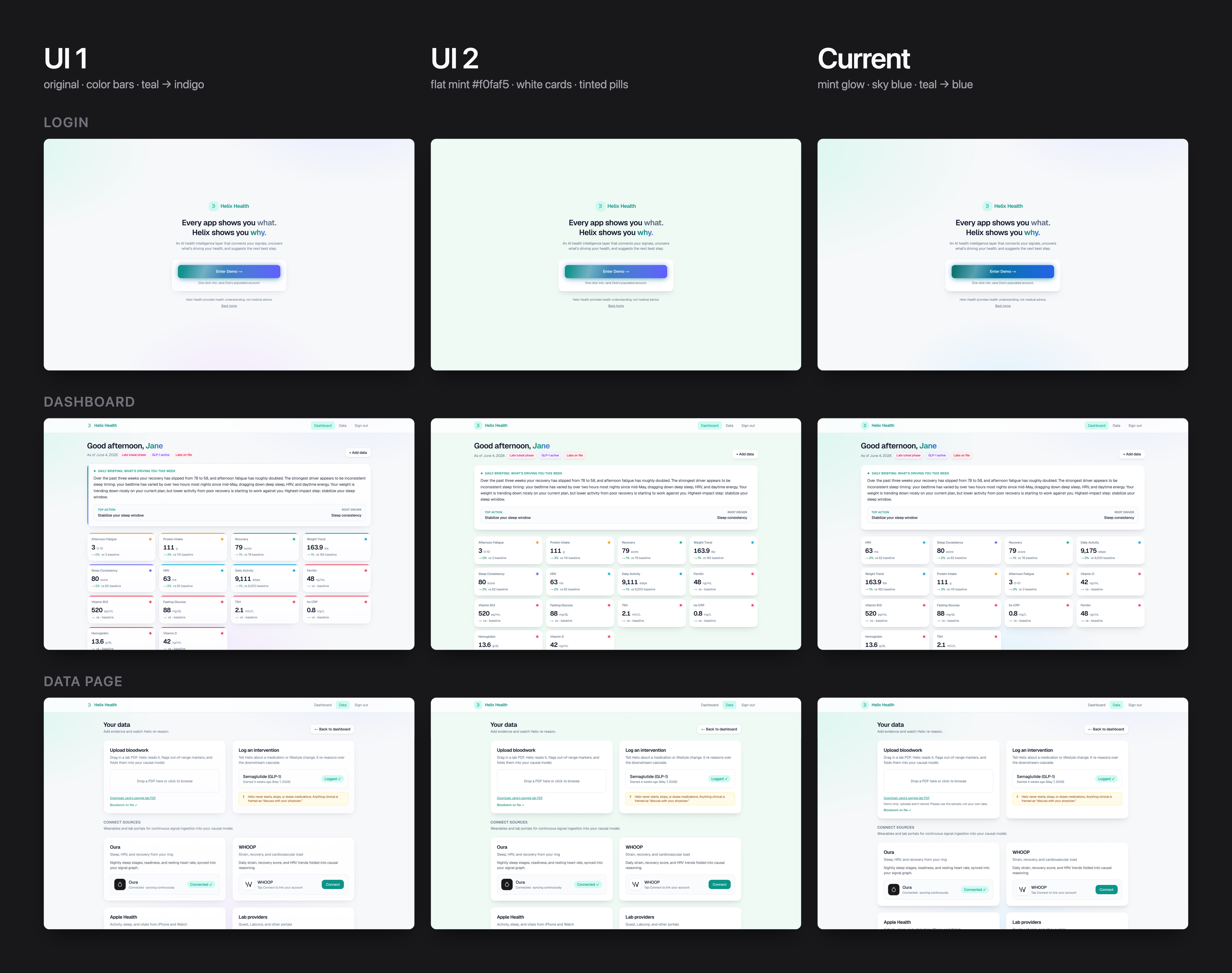
After shipping the MVP, I iterated on the UI in three rounds. UI 1 was the original: a grey-blue background with mint, blue and lavender glows, colored accent bars that clipped at the card corners, and teal-to-indigo gradients. For UI 2, I tested a flat soft mint background (#f0faf5), removed the accent bars, lifted the cards with layered drop shadows, restyled the status pills as tinted badges, and brought the favicon's mint tile into the navigation.
Every change was checked against WCAG 2.2 AA, which requires a contrast ratio of at least 4.5:1 for normal text. The audit caught text that already fell short: muted grey labels measured 4.04 to 4.48:1, green trend values 3.65:1, two of the status pills about 4.1:1, and the white text on the main buttons as low as 3.74:1. I darkened the grey to #5b6b80 (4.62:1 or higher), moved the green to a deeper emerald (5.36:1), rebuilt the status pills as tinted badges with darker text, and moved the button gradient to a deeper teal and true blue (5.17:1 or higher). All three pills now pass WCAG 2.2 AA contrast.
The current UI keeps the cards, shadows, pills and logo from UI 2 with a new background: a wider mint glow in the top-left that fades into a soft blue-white, with sky blue in place of the lavender. A soft gradient gives the product a lighter, more refreshing feel than a flat color, and swapping the lavender and indigo for sky blue and true blue keeps the palette on brand: mint and blue.
| Pill | Background | Text | WCAG Contrast |
|---|---|---|---|
| Late luteal phase | soft pink #fdf2f8 | deep pink #be185d | 5.53:1 AA pass |
| GLP-1 active | soft violet #f5f3ff | deep violet #6d28d9 | 6.48:1 AA pass |
| Labs on file | soft rose #fff1f2 | deep rose #be123c | 5.72:1 AA pass |
Next.js 15, React 19, TypeScript, Tailwind CSS v4, Framer Motion, Anthropic SDK (Claude Opus 4.8 and Haiku 4.5), Zod, Supabase (Postgres, Auth, Storage, RLS), Vercel.
I shipped a working AI health-intelligence MVP. It has two live AI surfaces: grounded causal reasoning over a structured evidence packet, and Claude reading biomarkers directly from an uploaded bloodwork PDF.
 Nadine E.